
Every marketing dollar you spend needs to deliver a return. While it’s easy to track clicks and opens online, many business owners wonder how to measure the impact of their printed materials. A modern bi-fold is more than just a handout; it’s a trackable marketing tool that can actively generate leads. By including elements like QR codes or custom URLs, you can bridge the gap between your physical and digital campaigns. This allows you to see exactly how customers are engaging with your materials. We’ll show you how to maximize the ROI of your custom bi-fold brochure design and print investment.
Key Takeaways
- Make every design choice count: The success of your folded document goes beyond the words on the page. Your selections for paper, size, and finish create a tactile experience that communicates quality, while a clean layout and consistent branding make your message clear and professional.
- Prepare your file like a pro: To get a final print that matches your on-screen design, a few technical steps are key. Always design in CMYK color mode, use high-resolution images (300 dpi), and add a bleed to your file to prevent printing mistakes and guarantee a flawless finish.
- Give your printed piece a job to do: A great design is only effective if it inspires action. Plan how you will distribute your materials and include a clear call to action with a QR code or custom URL so you can easily track engagement and measure your campaign’s success.
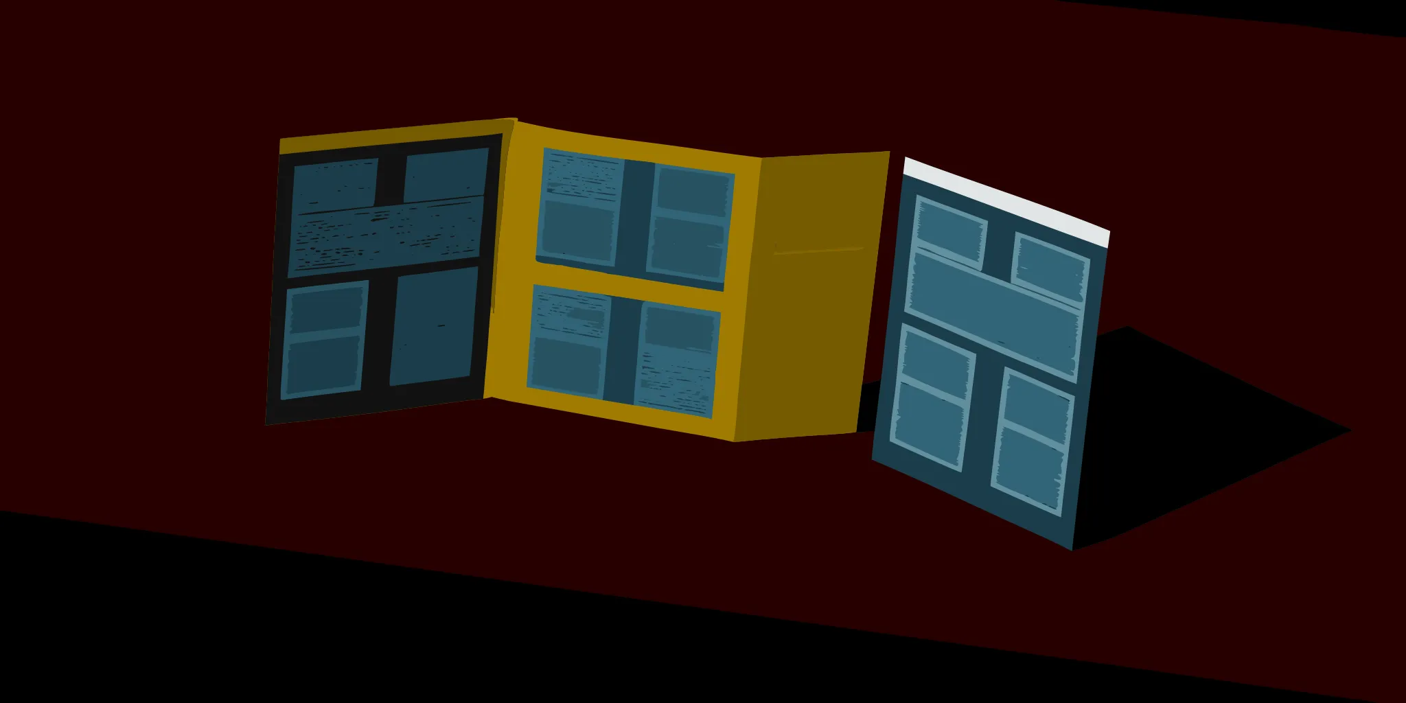
What Is a Custom Bi-Fold?
If you’re looking for a classic and effective way to tell your brand’s story, the custom bi-fold is a fantastic choice. Think of it as a single sheet of paper, folded in half like a book. This simple fold creates four distinct panels: a front cover to grab attention, two internal panels for your core message, and a back cover for contact details and a call to action. It’s a straightforward format that gives you a structured space to lay out information in a way that’s easy for your audience to follow.
This format is incredibly versatile, making it a go-to for everything from event handouts to informational leave-behinds. Whether you’re introducing your company, detailing your services, or showcasing a new product line, the bi-fold provides a tangible way to connect with customers. It’s a powerful piece of your overall advertising and media solutions strategy, helping you make a professional impression that lasts.
The Anatomy of a Bi-Fold
At its core, a bi-fold is defined by its single fold. This creates a familiar, book-like experience that people intuitively know how to open and read. When you start designing, you’ll work with four panels, which gives you a front cover, a back cover, and a spacious two-panel spread on the inside. You can choose from several standard sizes, like 8.5″ x 11″ or 11″ x 17″, depending on how much information and imagery you need to include. The paper you select also plays a huge role in the final feel, with options ranging from standard to premium thick stocks in either a modern matte or a vibrant glossy finish.
Why Bi-Folds Are an Effective Marketing Tool
Bi-folds are a marketing staple for a reason: they work. Their compact size makes them easy to distribute, display on a counter, or include in a direct mail campaign. While they are simple to handle, they provide ample room for compelling text and eye-catching visuals. This format is especially great for designs that rely on large, impactful images to showcase your work, like stunning vehicle wraps or expansive banners. A well-designed bi-fold serves as a powerful, tangible marketing tool that can introduce your business, highlight special offers, and give potential customers in the Portland area a professional piece of your brand to take with them.
How to Customize Your Bi-Fold Brochure
Once you’ve decided a bi-fold is right for your marketing goals, the fun part begins: making it your own. Customization is what turns a simple piece of paper into a powerful representation of your brand. From the size and feel to the final finish, every choice you make contributes to the story you’re telling. These printed pieces are a fantastic way to connect with your audience, but only if they are thoughtfully designed. Let’s walk through the key decisions that will shape your final design and ensure it resonates with your customers. Taking the time to get these details right will make all the difference in the effectiveness of your marketing materials.
Choosing Your Size and Dimensions
The first choice you’ll make is the size of your folded document. This decision affects everything from your design layout to how your audience interacts with it. Common options include standard letter size (8.5″ x 11″) folded in half, but you can also find larger formats like 11″ x 17″ for more visual impact. Think about your content and purpose. Are you creating a compact handout or a detailed, image-heavy presentation? Many printers also offer custom sizing, giving you the freedom to create something truly unique that fits your specific needs and helps your advertising and media solutions stand out.
Selecting the Right Paper and Weight
The paper you choose says a lot about your brand before a single word is read. The weight and texture of the paper create a tactile experience that can communicate quality and permanence. A thicker, heavier paper stock often gives a more premium and durable impression, making it great for high-end marketing. A standard paper weight might be perfect for wider distribution where budget is a key factor. Consider how the item will be used. If it needs to stand up on a counter or endure being passed around, a sturdier paper is the way to go. Explore all the print products available to find the perfect match for your project.
Picking a Finish: Matte, Glossy, and More
The finish is the final touch that can make your design shine, literally. A glossy finish is excellent for making colors pop and giving images a vibrant, high-energy look. It’s perfect for designs that are rich with photography. On the other hand, a matte finish provides a more subdued, sophisticated appearance with no glare, which is ideal for text-heavy layouts and elegant designs. You might also consider an uncoated finish for a more natural, organic feel. The right finish should complement your design and reinforce the message you want to send, ensuring your marketing piece looks professional and polished.
Using Design to Reflect Your Brand
Your folded handout is a direct reflection of your brand, so its design should be a seamless extension of your company’s identity. This is your chance to put your brand’s personality on paper. Use your established color palette, fonts, and logo to maintain consistency and build recognition. Whether you use a pre-made template as a starting point or create a completely custom design from scratch, every element should feel intentional and aligned with your brand. This consistency is a core part of our business solutions, as it helps build trust and ensures your customers have a cohesive experience with your brand across all materials.
What Makes a Great Bi-Fold Design?
A great design does more than just look good; it communicates a clear message and guides your audience on a short journey. When you’re working with a bi-fold format, you have four distinct panels to tell your story. Think of the front panel as your first impression, the inside panels as the core conversation, and the back panel as your closing statement with a clear call to action. The key is to create a seamless flow from one panel to the next. A well-designed piece feels intuitive, making it easy for your customers to understand your message and know what to do next. It’s about balancing compelling visuals with readable text to create something that people actually want to hold onto.
Organizing Your Layout and Panels
Think of your bi-fold marketing piece like a mini-book. It folds in half, giving you four panels to work with: a front cover, two inside panels, and a back cover. Each one has a specific job to do. The front cover needs to grab attention with a compelling headline and striking visual. When opened, the two inside panels work together to present your main information. This is where you can detail your services, showcase a project, or tell your brand story. Finally, the back panel is the perfect spot for your contact information, social media handles, and a strong call to action (CTA).
Choosing Your Typography and Colors
The fonts and colors you choose set the entire mood for your printed piece. Stick to one or two easy-to-read fonts: one for headlines and another for body text. Your color palette should align with your brand identity to maintain consistency across all your marketing materials. When preparing your design for print, it’s crucial to use the CMYK color model, not RGB. Screens use the RGB (Red, Green, Blue) model to display color, while printers use CMYK (Cyan, Magenta, Yellow, Black). Designing in CMYK from the start ensures the colors in your final print are as vibrant and accurate as you intended.
Using High-Quality Images and Graphics
Pixelated or blurry images can make even the best design look unprofessional. Since bi-folds are perfect for showcasing visuals, make sure every image you use is high resolution. For print, the standard is 300 dots per inch (dpi). If you pull an image from a website, it’s likely low resolution (72 dpi) and will look fuzzy when printed. Invest in professional photography or use high-quality stock images that reflect your brand’s quality and style. Remember, your images are telling a story, so choose visuals that support your message and resonate with your Portland-area audience.
Mastering White Space and Visual Hierarchy
Don’t be afraid of empty space. In design, we call this “white space,” and it’s one of your most powerful tools. It gives your content room to breathe, making it easier for readers to digest the information without feeling overwhelmed. A cluttered design is a confusing design. Along with white space, use visual hierarchy to guide the reader’s eye. This means using different sizes, weights, and colors to signal which elements are most important. Your main headline should be the most prominent element, followed by subheadings, and then the body text. This creates a clear path for the reader to follow.
What Are Bleed, Trim, and Safe Zones?
Getting your file ready for a professional printer like APM Printworks involves a few technical steps, but they’re simple once you understand them. First is the “bleed,” which is a small extra margin of your design that extends beyond the final cut size. This ensures there are no unprinted white edges on your final piece. The “trim line” is where the piece will be cut to its final size. Finally, the “safe zone” is an inner margin where you should keep all your important text and logos. Anything outside this zone risks being trimmed off. Following these print-ready guidelines is the secret to getting a perfectly finished product every time.
What Software Should You Use to Design a Bi-Fold Brochure?
Choosing the right software to design your bi-fold brochure really comes down to your comfort level with design and the complexity of your vision. Whether you’re a seasoned graphic designer or a complete beginner, there’s a tool out there that can help you bring your ideas to life. The key is to find the one that fits your skills and budget, so you can focus on creating a design that connects with your audience. Let’s walk through some of the most popular options, from professional-grade programs to more user-friendly platforms.
Professional Design Tools
If you’re aiming for a completely custom, high-end result, industry-standard software is the way to go. Programs like Adobe InDesign and Illustrator are built for this kind of work. Many professionals consider InDesign the go-to software for print design because it gives you precise control over every element, from typography to page layout. It’s perfect for arranging text and images across your panels. Adobe Illustrator is another powerhouse, especially for creating custom vector graphics, logos, and icons. Using these tools ensures your final file is perfectly prepped for printing, giving you a crisp, professional finish every time.
Beginner-Friendly Options
Don’t have a background in graphic design? No problem. There are plenty of intuitive tools that make it easy to create a beautiful bi-fold without a steep learning curve. Canva is a fantastic choice for beginners, offering a drag-and-drop interface and a huge library of easy-to-use templates to get you started. You can customize colors, fonts, and images to match your brand in just a few clicks. Another accessible option is Microsoft Publisher. If you’re already familiar with the Microsoft Office suite, you’ll find its interface straightforward for creating simple yet effective layouts for your marketing materials.
Working With a Professional Designer
If designing isn’t your strong suit or you simply don’t have the time, hiring a professional designer is an excellent investment. A skilled designer does more than just make things look good; they use their expertise to create a layout that effectively communicates your message and guides the reader’s eye. They are masters of the professional tools and understand the technical requirements for printing, ensuring a flawless final product. Plus, working with a graphic designer saves you valuable time and guarantees your bi-fold aligns perfectly with your brand identity, making it a powerful marketing asset.
Common Bi-Fold Brochure Design Mistakes
Even the most carefully planned bi-fold brochure can fall flat if you make a few common design mistakes. A great design is about more than just looking good; it’s about clear communication that guides your reader. By steering clear of these pitfalls, you can create a piece that not only captures attention but also drives results for your business. Let’s walk through some of the most frequent missteps and how you can avoid them.
Avoid Overcrowding the Panels
It’s tempting to pack every bit of information into your brochure, but this can backfire. When a design is too busy, it overwhelms the reader, and your main message gets lost in the noise. Think of white space as a crucial design element, not just empty background. It gives your content room to breathe and helps guide the reader’s eye to the most important points. A clean layout with focused text and impactful images will always be more effective than a cluttered one. Remember, the goal is to make your information easy to digest, not to present a wall of text.
Don’t Neglect the Fold Area
The central fold is a defining feature of a bi-fold brochure, but it can also be a trouble spot. Any text or critical parts of an image placed directly on the fold line risk being obscured or distorted when the piece is closed. Before you send your file to print, double-check that all your key design elements and text are positioned safely away from the fold. This simple step ensures your layout remains legible and visually appealing, preserving the professional look you’ve worked hard to create. Think of the fold as a natural divider for your panels, not a place for content.
Maintain Consistent Branding
Your brochure is a direct reflection of your business, and it should feel like a natural part of your brand. Using inconsistent colors, fonts, or logo variations can confuse your audience and weaken your brand’s credibility. Your design should instantly connect back to your company’s established brand’s identity. This means using the same color palette, typography, and logo that appear on your website and other marketing materials. This consistency builds recognition and trust, making your message more impactful and reinforcing who you are in the customer’s mind.
Include a Clear Call to Action
A beautiful brochure is great, but a beautiful brochure that doesn’t tell the reader what to do next is a missed opportunity. Every marketing piece should have a purpose, and the call to action (CTA) is how you achieve it. Do you want readers to visit your Portland storefront, check out your website, or call for a quote? State it clearly and directly. A strong CTA should be easy to spot and simple to follow. Placing it in a prominent location, like the back panel, ensures it’s one of the last things your reader sees.
Always Proofread Your Work
This might seem obvious, but it’s a step that’s surprisingly easy to skip when you’re eager to get your design to the printer. Typos and grammatical mistakes can make your business appear unprofessional and undermine the credibility of your message. After you’ve finished your design, take a break and come back to proofread it with fresh eyes. Even better, have a colleague or friend review it for you. A thorough proofread of your content is the final quality check that ensures your brochure is polished, professional, and ready to represent your brand.
How Do You Prepare Your File for Print?
You’ve spent hours perfecting your design, and now it’s time for the final handoff. Preparing your file correctly for print is the single most important step to ensure the final product looks exactly as you imagined it on your screen. Getting these details right from the start saves time, prevents costly reprints, and guarantees a professional result. Think of it as giving your printing partner the perfect blueprint to bring your vision to life. This isn’t just a technical checklist; it’s the bridge between your digital creation and a tangible piece that represents your brand. Whether you’re creating large banners or detailed safety signage, a properly prepared file communicates all your specifications clearly. It tells the printer exactly what colors to use, where to cut, and how to scale everything perfectly. Without this careful preparation, colors can appear dull or mismatched, images can look fuzzy, and important information might get trimmed off. Taking a few extra minutes to follow these steps ensures that all your creative effort shines through in the final product, without any unwelcome surprises.
Setting Up the Correct Document Size
Before you place a single element, make sure your digital canvas is set to the exact dimensions of the final printed piece. Whether you’re working with a standard size or creating something completely custom for your advertising and media solutions, this initial setup is crucial. Starting with the correct size ensures that your layout, text, and images will fit perfectly without any awkward stretching or surprise cropping later on. It’s a simple step that prevents a lot of headaches down the line and gives you full control over the final composition of your project.
Meeting Resolution and Color Mode Requirements
For a crisp, professional look, your file needs to speak the language of printing. First, set your document’s color mode to CMYK (Cyan, Magenta, Yellow, Key/Black), not RGB (Red, Green, Blue). While RGB is perfect for digital screens, CMYK is the four-color process used by commercial printers. Second, ensure all your images have a resolution of at least 300 dots per inch (dpi) at their final print size to avoid a blurry or pixelated finish. Finally, add a .125-inch “bleed” area around your entire design. This extra margin ensures your colors and images extend to the very edge of the paper after it’s trimmed.
Exporting a Print-Ready File
Once your design is complete and you’ve double-checked the specs, it’s time to export. While printers may accept formats like JPG or PNG, the gold standard is a high-quality PDF. A print-ready PDF is a self-contained file that embeds your fonts, images, and layout instructions, ensuring nothing shifts or changes when it’s opened on another computer. This makes it the most reliable format for all kinds of business solutions. Always check with your printer for their specific file requirements, but exporting as a PDF is almost always the safest and most effective choice for a flawless print run.
What Determines Your Brochure Printing Costs?
Figuring out the cost of printing your brochures isn’t a one-size-fits-all answer. The final price tag depends on the specific choices you make for your project. Think of it like building a custom piece of furniture; the materials you choose and the complexity of the design will influence the total cost. Understanding these key factors allows you to make informed decisions that align with both your marketing goals and your budget. The main elements that shape your printing quote are the physical specifications of your brochure, the total number you order, and how quickly you need them. By getting familiar with these variables, you can strategically plan your project to get the best possible value without compromising on the quality your brand deserves.
Factors That Drive the Price Up or Down
The biggest cost drivers are tied to the physical materials of your brochure. Size is a great place to start; while standard sizes are most cost-effective, you can also opt for custom dimensions to make your design stand out. Next is the paper itself. You’ll have a choice of different paper weights and types, from thinner, lighter stocks to thick, premium card stocks. Finally, the finish you select, such as a shiny gloss, a smooth matte, or a simple uncoated look, will affect both the price and the final impression your brochure makes. Each of these choices contributes to the overall look, feel, and cost of your project.
How Quantity Affects Cost Per Unit
When it comes to printing, ordering in larger quantities almost always lowers the price per brochure. This is because of the setup involved. A significant portion of the cost is in the initial preparation of the printing press for your specific job. Whether you print 100 brochures or 10,000, that setup cost remains relatively the same. By printing a larger batch, you spread that initial cost across more units, making each one cheaper. This is why a rush order of 250 might seem pricey per piece, while a larger order for your next direct mail campaign feels much more economical. Planning ahead and ordering the right amount can make a big difference to your budget.
Balancing Quality With Your Budget
Creating a brochure that fits your budget doesn’t mean you have to settle for low quality. It’s about making smart, strategic choices. If your brochure is for a high-end sales presentation, investing in a premium, durable 100 lb. paper stock with a protective high-gloss UV coating is a wise decision. For a wider distribution, a more standard but still professional paper might be the perfect fit. Your design is another area where you can balance cost and quality. Using a professional designer or a well-vetted template ensures your file is print-ready, which can save you from costly errors and reprints down the line. These thoughtful decisions are key to effective advertising and media solutions.
How to Choose the Right Printing Service
Finding the right partner to bring your marketing vision to life is just as important as the design itself. The quality of your printed materials, from direct mailers to event banners, directly reflects on your brand. When you’re ready to print, you need a service that can deliver on quality, speed, and reliability. The goal is to find a partner who not only understands your technical needs but also supports your business goals, ensuring every piece you produce makes a powerful impression.
Choosing a printer is a big decision, but it doesn’t have to be overwhelming. By focusing on a few key areas like print capabilities, turnaround time, and customer support, you can confidently select a service that will become a valuable extension of your team. Let’s walk through what to look for.
Reviewing Print Quality and Capabilities
Before committing to a print service, take a close look at their work. A reputable printer should be proud to show you samples of their finished products. Ask to see examples on different materials, whether it’s vinyl for a large banner or various paper stocks for a folded mailer. Pay attention to the color vibrancy, image sharpness, and overall finish. Does the quality meet your brand’s standards? A great printer will offer a range of options and help you select the best materials and finishes to make your design pop, ensuring your final product looks professional and polished.
Considering Turnaround Time and Reliability
In business, deadlines are everything. Whether you’re preparing for a last-minute event or launching a time-sensitive direct mail campaign, you need a printing partner who can keep up. When evaluating services, ask about their standard turnaround times and if they offer expedited options. More importantly, look for a track record of reliability. A printer that consistently delivers on time is an invaluable asset. Fast and dependable service means you can execute your marketing plans without worrying about delays, ensuring your materials are in hand exactly when you need them.
Evaluating Customer Support and the Proofing Process
Great customer support can make the entire printing process smoother. Look for a team that is responsive, knowledgeable, and willing to guide you. A crucial part of this is the proofing process. A good printer will provide a digital proof, which is a final preview of your design for you to approve before anything goes to print. This is your chance to catch any typos or design errors. A supportive partner will help you prepare your files correctly and answer any questions, ensuring the final piece is flawless and exactly what you envisioned.
APM Printworks: Your Portland Printing Partner
For businesses in the Portland area, APM Printworks is the local partner you can count on. We combine high-quality results with the speed and reliability your business needs. Our team is here to guide you through every step, from selecting the right materials for your advertising and media solutions to ensuring your files are print-ready. We offer a comprehensive proofing process and the personalized support you’d expect from a local expert. When you need a partner who is as committed to your project’s success as you are, we’re here to help you get it done right.
Get the Most Out of Your Printed Brochures
Once your custom bi-folds are printed and in your hands, the real work begins. A beautifully designed print piece is a powerful tool, but its success depends on a smart distribution strategy. Instead of just leaving them in a stack on a counter, you can turn your bi-folds into active marketing assets that generate leads and drive sales. By pairing them with other materials, using them in targeted campaigns, and building in ways to track their performance, you can ensure you get a real return on your investment.
Pairing Bi-Folds With Other Print Materials
Think of your custom bi-fold as a key player on your marketing team, not a solo act. They are an affordable and effective way to share detailed information, but they work best when they support your other marketing efforts. You can create a more powerful brand impression by pairing them with larger, attention-grabbing materials. For example, a vibrant banner or sign can draw customers to your storefront or event booth from a distance. Once they’re close, you can hand them a bi-fold that provides the story, specs, and contact information they need to make a decision. This approach creates a complete and cohesive experience, using different advertising solutions to guide a customer from initial interest to final action.
Creating Direct Mail Campaigns That Drive Results
In an era of overflowing inboxes, a tangible piece of mail can make a real impact. Bi-folds are perfectly suited for direct mail because they offer plenty of space for compelling text and images while remaining compact and lightweight. A targeted direct mail campaign allows you to reach specific households or businesses in the Portland area with a personal touch that digital messages often lack. Because they are so simple and effective, bi-folds give you a physical presence in a potential customer’s home or office. This helps you build brand recognition and deliver your message directly into the hands of the people you want to reach, without getting lost in the digital noise.
Tracking Results With QR Codes and Custom URLs
One of the biggest questions in print marketing is: “How do I know if it’s working?” Thankfully, you can easily measure the impact of your bi-folds by bridging the gap between your physical and digital marketing. By adding a QR code or a custom URL to your design, you give readers a direct path to your website. You can use QR codes to send people to a specific landing page with a special offer, a video demonstration, or a contact form. This not only makes it easy for customers to respond to your call to action but also allows you to track exactly how many visits and leads your print campaign is generating.
Related Articles
- Custom Flash Card Printing: Your Ultimate Guide
- 4×9 Printing: The Ultimate Guide for Businesses
- Which Banner Printing Format Should You Use?
- What is Collateral Advertising? A Simple Guide
Frequently Asked Questions
When is a bi-fold the right choice for my marketing? A custom bi-fold is perfect when you need to tell a structured story. Think of it as the ideal format for introducing your company, detailing your services, or presenting a specific project. It gives you enough room for compelling images and text without overwhelming your audience. It’s a great choice for a tangible leave-behind after a meeting, a direct mail piece, or an informational handout that gives customers a professional piece of your brand to take with them.
My design looks great on screen. How do I make sure it prints just as well? This is a common concern, but it’s easy to manage with a few key steps. First, make sure your design file is set to the CMYK color mode, which is the standard for professional printing, instead of the RGB mode used for screens. Second, all your photos and graphics should be high resolution, which means 300 dpi at their final size, to ensure they look sharp and not pixelated. Finally, exporting your file as a high-quality PDF helps lock in all your fonts and images, so nothing shifts or changes on its way to the printer.
How can I get a high-quality printed piece without going over my budget? Balancing quality and cost is all about making strategic choices. Ordering a larger quantity at once will significantly lower your cost per piece, so planning ahead can lead to big savings. You can also choose a professional-looking standard paper stock instead of a premium one for wider distribution. The key is to match your materials to your goal. A durable, glossy finish might be worth the investment for a sales presentation, while a simpler finish works perfectly for a mass mailing.
How should I organize the information across the four panels? Think of your bi-fold as a mini-story with a beginning, middle, and end. The front cover is your first impression, so use it to grab attention with a strong headline and a compelling image. The two inside panels work together as a spread to deliver your main message and supporting details. This is where you tell your story or explain your services. The back panel should close the loop with your contact information, website, and a clear call to action telling the reader exactly what to do next.
How can I track the success of my printed marketing materials? You can easily measure the effectiveness of your printed pieces by connecting them to your digital presence. Including a QR code or a custom URL in your design gives people a simple, direct path to a specific page on your website. You can link to a special offer, a video, or a contact form. By using these trackable links, you can see exactly how many people are engaging with your printed materials, giving you clear insight into your campaign’s performance.