
Every construction site serves two major functions: it’s a place of work, and it’s a powerful marketing tool. Your top priority is keeping everyone safe, but you also can’t ignore the opportunity to build your brand’s reputation within the community. How do you balance these critical needs? The answer lies in smart construction sign board design. A well-designed sign can clearly communicate safety warnings to prevent accidents while also showcasing your company’s logo and professionalism to potential clients. It’s about creating a cohesive system where every sign, from the large project banner to the small hazard warning, works together to protect people and promote your business effectively.
Key Takeaways
- Make your message impossible to miss: Design signs with high-contrast colors, bold and simple fonts, and concise text to ensure your safety warnings and directions are understood in a single glance.
- Choose the right materials and location: Select durable, weather-resistant materials that can handle the tough environment of a construction site, and install them in clear, unobstructed sightlines to maximize visibility.
- Combine safety compliance with smart branding: Incorporate your company logo and colors to build brand recognition, but always ensure these elements support, rather than distract from, the primary safety information.
What Makes a Construction Sign Effective?
An effective construction sign does more than just check a compliance box. It communicates critical information, keeps workers and the public safe, and represents your brand on-site. When a sign is well-designed, it cuts through the noise of a busy work zone to deliver its message clearly and instantly. Think of your signs as silent project managers, guiding traffic, warning of hazards, and reinforcing your company’s commitment to safety and professionalism.
The difference between a great sign and a mediocre one comes down to a few key design principles. It’s not about cramming as much information as possible onto a board. Instead, it’s about strategic choices in visibility, color, and typography. These elements work together to ensure your message is understood at a glance, from a distance, and in any weather condition. Getting these details right is essential for creating effective safety materials that protect everyone on and around your site.
Focus on Visibility and Readability
A sign’s first job is to be seen. If it’s hidden, too small, or poorly lit, its message is lost. Visibility is about more than just size; it’s about strategic placement where people will naturally look. Consider the sightlines of drivers, pedestrians, and on-site workers. Lighting also plays a huge role, especially for signs that need to be visible at dawn, dusk, or overnight.
Readability is what makes the message stick. The best practice is to keep it simple. Use clear, concise language and avoid cluttering the sign with too much text or too many images. A sign that can be read and understood in a few seconds is one that works. This clarity helps everyone find their way around your site easily and safely, preventing confusion and potential accidents.
Use Color to Communicate Clearly
Color is one of the fastest ways to communicate. On a construction site, specific colors have standardized meanings that people instantly recognize, like red for danger or prohibition and yellow for caution. Using these conventions helps convey your message without a single word. Beyond standard safety colors, your choice of color combinations can make or break your sign’s legibility.
The key is contrast. High-contrast pairings, like black text on a white or yellow background, are easily readable from far away. While your brand colors are important, they shouldn’t compromise the sign’s primary function. If your logo uses low-contrast colors, consider placing it on a neutral background to ensure the important safety information remains the star of the show and your design can pop from a distance.
Select Fonts That Are Easy to Read
When it comes to fonts, clarity trumps creativity every time. Avoid decorative, script, or overly complex fonts that are difficult to decipher from a distance. Stick with clean, bold, sans-serif typefaces like Helvetica, Arial, or Futura. These fonts are designed for legibility and are the standard for a reason. The goal is for someone to read the sign quickly and without any effort.
Font size is just as crucial as the style. The text must be large enough for people to read from a safe distance, whether they’re in a moving vehicle or walking by. For critical safety messages, pairing text with universally recognized symbols or pictograms is a great strategy. This approach overcomes language barriers and ensures everyone understands the message, making your large format signs as effective as possible.
Choose the Best Materials for Your Signs
A great design can fall flat if it’s printed on the wrong material. The environment of a construction site is tough, with exposure to rain, sun, and physical wear. Choosing the right material ensures your signs not only look professional but also hold up for the entire duration of your project. Let’s walk through some of the most common and effective options for construction signage.
The Benefits of Aluminum
Aluminum is the go-to choice for durable, long-lasting outdoor signs, and for good reason. It’s incredibly strong and resistant to rust, making it perfect for signs that need to withstand the elements for months or even years. Think about those essential warning signs or property identification signs that need to stay put and remain legible throughout a long project. Aluminum signs provide a sturdy, professional look that reflects the quality of your work. Because they are so resilient, they are an excellent investment for critical safety materials that must remain visible and intact to keep your site compliant and your team safe.
When to Use Plastic and Composites
While aluminum is fantastic for permanence, sometimes you need a more flexible or temporary solution. This is where plastic and composite materials shine. Options like corrugated plastic are lightweight, easy to install, and more cost-effective, making them ideal for short-term needs. You might use them for signs announcing project phases, temporary directional signs for site traffic, or event-specific signage. They offer a great way to display vibrant, large format graphics for a limited time without committing to the cost of a more permanent material. When your message is temporary, these materials provide a practical and budget-friendly alternative.
Add Weather-Resistant and Reflective Coatings
Regardless of the base material you choose, adding a protective coating can dramatically extend the life and effectiveness of your signs. Weather-resistant laminates shield your signs from UV rays, preventing fading and discoloration from sun exposure, while also protecting them from moisture and grime. For signs that need to be seen around the clock, a reflective coating is a must. This finish bounces light from headlights or flashlights, making your signs highly visible in the dark or during Portland’s gray, rainy days. This is especially critical for hazard warnings and directional signs, ensuring your safety messages are communicated clearly 24/7.
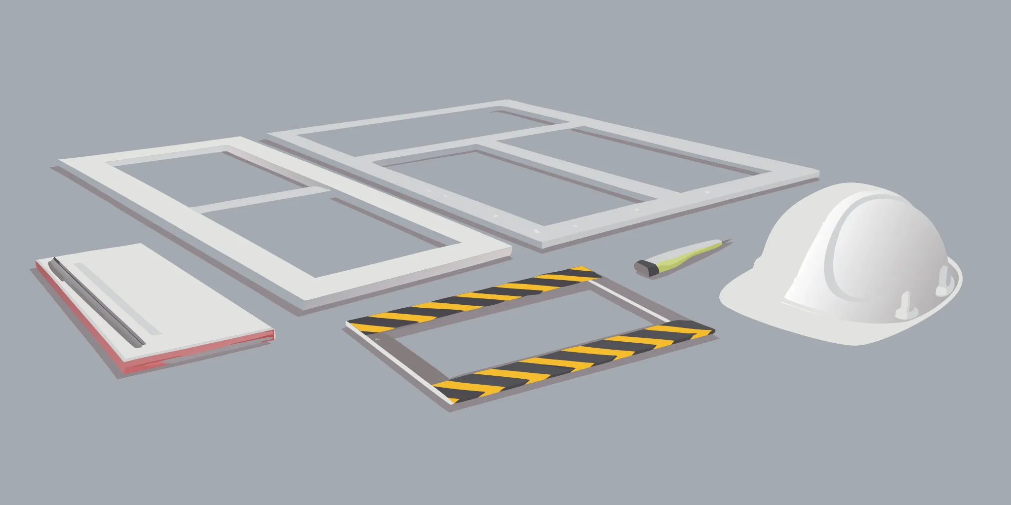
Common Types of Construction Signs
Construction signs do more than just check a box for compliance. They are essential communication tools that keep your site safe, organized, and professional. From warning of potential dangers to promoting your brand to the public, each sign has a distinct job. Understanding the main categories will help you create a comprehensive signage plan that covers all your bases, ensuring everyone from your crew to passing pedestrians knows exactly what’s going on.
A well-signed construction site is a safer and more efficient one. Let’s look at the three primary types of signs you’ll need.
Safety and Hazard Warnings
First and foremost, your signs must protect people. Construction safety signs are a critical part of your site’s safety plan, designed to prevent accidents before they happen. These signs communicate immediate dangers, mandate personal protective equipment (PPE), and provide emergency information. Think of signs that warn of high voltage, falling debris, or deep excavations.
Effective safety signs are clear, concise, and impossible to miss. Unfortunately, poor visibility and incorrect placement are frequent mistakes that can lead to serious incidents. By using bold colors, simple graphics, and durable, reflective materials, you ensure these vital warnings are seen and understood by every person on your site, day or night.
Project and Brand Identification
While your crew is hard at work, your construction site is also a powerful advertising opportunity. Large, professionally printed signs and banners identify the project and showcase your company’s brand to everyone who passes by. This is your chance to build name recognition and demonstrate your professionalism to potential clients in the community. Think of fence banners, post-and-panel signs announcing the future home of a new business, or signs that feature your company logo and contact information.
These custom construction signs act as a 24/7 billboard for your business. They tell a story about the quality of your work and the pride you take in your projects, helping you attract future business long before the current job is complete.
Directional and Wayfinding Signs
A busy construction site can be a confusing place, especially for visitors, new workers, or delivery drivers. Directional and wayfinding signs are the solution. These signs create a clear flow of traffic for both vehicles and pedestrians, guiding them to specific locations like the site office, delivery drop-off points, designated parking areas, and restrooms.
By providing clear guidance, you reduce confusion and improve overall site efficiency. Well-placed directional signs also contribute to safety by keeping unauthorized personnel out of restricted areas and ensuring emergency services can find their way quickly if needed. These practical, informative signs are a simple way to keep your project organized and running smoothly from start to finish.
Customize Your Signs for Maximum Impact
A great construction sign does more than just point the way or warn of a hazard; it’s a reflection of your company’s professionalism and attention to detail. Customizing your signs is your chance to combine safety compliance with smart branding. By thinking through your design elements, you can create signs that are not only effective at communicating critical information but also work to build brand recognition and trust with the public and your partners.
Think of your construction site as a temporary storefront. Every sign, from the large project identification banner at the entrance to the small directional markers inside, is an opportunity to present a cohesive and professional image. A well-designed sign shows you care about safety, quality, and clear communication. It tells a story about your brand before anyone even steps foot on the site. Taking the time to customize your signage ensures every message is clear, every warning is understood, and your brand looks its best. This is where you can turn a simple requirement into a powerful asset for your project.
Weave in Your Branding
Your construction site is a prime advertising space, and your signs are the billboards. Beyond just displaying your company name, you can weave your brand’s identity into every sign you post. Consistently using your company’s color palette and fonts helps build brand recognition with every person who passes by. Think about how your advertising and media solutions can extend to your worksite. When your project signs, safety warnings, and directional signs all share a consistent look, it creates a polished, professional image that reinforces your company’s credibility. This simple step helps promote your company and project long before the work is even finished.
Nail Your Safety Messaging
When it comes to safety, there’s no room for confusion. The primary goal of any construction safety sign is to prevent accidents by making people aware of potential hazards. Your messaging needs to be direct, clear, and instantly understandable. Ensuring that your signs meet established safety guidelines not only helps prevent injuries but also protects you from potential liabilities. Every word and image should be chosen to improve workplace hazard awareness. Work with a provider who understands the requirements for effective safety materials to ensure your signs are compliant and, most importantly, keep your team and the public safe.
Perfect Your Logo Placement
Your logo is your company’s signature, and its placement on a sign is key to building brand visibility. On large-format signs like banners or project identification boards, your logo should be prominent and easy to see from a distance. This turns your sign into a powerful marketing tool. However, on safety and warning signs, the primary message must always take priority. Place your logo at the top or bottom of the sign, ensuring it doesn’t distract from the critical safety information. Strategic placement on large format signs ensures your brand gets noticed without compromising the sign’s main function.
Use Graphics and Symbols for Clarity
A picture is worth a thousand words, especially on a busy construction site. Using standardized symbols and graphics is one of the best ways to communicate a message quickly and effectively, overcoming language barriers and literacy levels. Safety signs often rely on universally recognized images and pictograms to convey warnings about everything from falling objects to high voltage. These visual cues grab attention and communicate risk much faster than text alone. When designing your signs, incorporate clear, standardized symbols to promote safety and ensure everyone on site understands the potential hazards at a glance.
Common Design Mistakes to Avoid
Even the most well-intentioned sign can fall flat if it’s hard to see, confusing, or placed in the wrong spot. Getting your design right is about more than just aesthetics; it’s about clear communication that keeps people safe and informed. Let’s walk through some of the most common design slip-ups so you can steer clear of them and create signs that truly work.
Low Visibility and Poor Contrast
A sign’s primary job is to be seen. If workers or the public have to squint to read your message, it’s not doing its job. Poor visibility is a frequent mistake that can lead to confusion or even accidents on a construction site. The fix is to focus on high contrast. Think bold, dark text on a light background or light text on a dark background. Colors like black on yellow or white on red are standard for a reason: they grab attention and are easy to read from a distance. Make sure your font is large and clear enough to be legible from the intended viewing distance, ensuring your message gets across instantly.
Too Much Information
When it comes to sign design, less is definitely more. It’s tempting to cram every detail onto a sign, but an overloaded design will overwhelm viewers. A person driving or walking by only has a few seconds to absorb the information. Stick to a single, clear message and use as few words as possible. The most effective signs often rely on universally understood symbols and graphics to communicate quickly. To keep your design clean and focused, limit your color palette to two or three high-contrast colors and choose a simple, bold font. This approach ensures your message is both readable and memorable.
Incorrect Placement and Non-Compliance
You could design the most brilliant sign in the world, but it’s useless if it’s hidden behind a stack of materials or positioned too high to read. The effectiveness of your signs depends heavily on their placement. Before installation, walk the site to find clear, unobstructed sightlines at the proper height for your audience, whether they are in a vehicle or on foot. Beyond visibility, you also need to ensure your signs meet legal standards. Following OSHA guidelines for safety signs isn’t just a good idea; it’s a requirement that helps maintain a safe work environment for everyone.
Choosing the Wrong Materials
Your signs are exposed to the elements 24/7, so they need to be tough. Choosing a material that can’t withstand sun, wind, and rain is a common mistake that can render a sign unreadable in a short amount of time. Faded, cracked, or peeling signs not only fail to communicate their message but also reflect poorly on your company’s professionalism. By choosing durable, weather-resistant safety materials, you ensure your signs remain vibrant and functional throughout your project’s duration. Investing in quality materials from the start saves you the cost and hassle of replacements down the road.
Stay Compliant with Legal Requirements
Designing a construction sign involves more than just picking the right colors and materials. To avoid fines and project delays, your signs must also meet a web of legal requirements that span federal, state, and local levels. Getting this right from the start saves you the headache and cost of having to replace non-compliant signs down the road. It also shows your commitment to safety and professionalism.
Think of compliance as three main layers. First, you have national standards from organizations like OSHA and ANSI, which set the bar for safety signage across the country. These guidelines ensure that warnings for hazards are clear and universally understood. Next, you have local city and county rules, which often dictate whether you need a permit to install a sign. Finally, these local regulations get into the specifics of size and placement, controlling how large your signs can be and where they can be located on your site. Working with a knowledgeable printer can help you meet these requirements, ensuring your signs are both effective and fully compliant.
Understand OSHA and ANSI Standards
When it comes to safety on a construction site, consistency is key. That’s where the Occupational Safety and Health Administration (OSHA) and the American National Standards Institute (ANSI) come in. These organizations establish clear, uniform standards for safety signs to ensure every worker, visitor, or passerby can quickly understand potential hazards. Their guidelines cover everything from color-coding (like red for “Danger” and yellow for “Caution”) to the use of specific signal words and symbols. Following these standards isn’t just about checking a box; it’s a fundamental part of creating a safer work environment and protecting your business from legal risks. You can learn more about the common construction signs and what they mean.
Check Local Permits and Zoning Rules
Beyond national safety standards, you also need to pay close attention to your local government’s rules. Cities like Portland have specific sign regulations designed to balance business needs with public safety and community aesthetics. Before you even place an order for a large project sign or fence wrap, you should find out if you need a permit. The process often involves submitting your sign design and a site plan for approval. Ignoring this step can lead to fines or orders to remove your sign. A quick check of the Portland sign permit guide or a call to the local planning department can clarify the requirements for your project.
Follow Size and Placement Regulations
Local zoning codes also get very specific about the physical characteristics of your signs. These rules dictate the maximum allowable size, height, and where a sign can be placed on a property. For example, a rule might state that a freestanding sign is only allowed if the site doesn’t front a major street, or it might specify how far a sign must be set back from the property line. These regulations are detailed in Portland’s Title 32 signs and related regulations. Taking the time to measure and confirm these details ensures your investment in a high-quality sign pays off and that it can stay exactly where you install it.
How to Choose the Right Sign Manufacturer
Once you’ve perfected your design, you need a partner who can bring it to life. The right sign manufacturer does more than just print; they ensure your signs are durable, compliant, and delivered on time. Think of them as an extension of your team, dedicated to making your project a success. Finding a local partner who understands the specific needs of businesses in the Portland area can make the process even smoother. When you start looking for a printer, focus on a few key areas to make sure you find the perfect fit for your project.
Look for High-Quality Work
When it comes to construction signs, quality is about more than just sharp graphics. It’s about durability and safety. Your signs need to withstand the elements and remain legible for the entire project duration. A great manufacturer prioritizes quality materials and printing processes that last. As experts at Star Signs note, “Identifying and correcting common design mistakes can significantly improve the effectiveness of your construction site signs.” A quality-focused partner will help you catch potential issues before printing. This is especially true for essential safety materials where adhering to standards is crucial for keeping your site compliant and your team safe.
Check Their Production and Customization Capabilities
Your project is unique, and your signage should be too. Look for a manufacturer with a wide range of production and customization options. Can they handle different materials, sizes, and finishes? A partner with versatile capabilities can produce everything from large banners to detailed wayfinding signs. According to 48HourPrint, a good sign maker lets you “make your signs unique by uploading your own design, using their online design tool, or picking from their free design templates.” This flexibility ensures your final product perfectly matches your brand and project needs. A one-stop shop can handle all your large format printing, saving you time and ensuring consistency across all your signs.
Clarify Turnaround Times and Service
Construction projects move fast, and you can’t afford to have your signage cause delays. Before committing to a manufacturer, get a clear understanding of their production schedule. Ask about typical turnaround times and if they offer expedited services for urgent needs. As Signs.com points out, some “signs can be ready to ship as fast as the next business day.” Knowing this upfront helps you plan your timeline effectively. Great service goes beyond speed; it also means clear communication and support. A reliable partner will be responsive to your questions and keep you updated on your order’s progress, giving you peace of mind.
How to Install and Maintain Your Signs
A well-designed sign is a powerful tool, but its impact depends entirely on how it’s installed and cared for. Proper mounting and regular upkeep ensure your message stays clear, your site remains safe, and your investment lasts. Think of it as the final, crucial step in bringing your sign’s purpose to life. By following a few key practices, you can make sure your signs work as hard as you do, from the first day of the project to the last.
Select the Right Mounting Hardware
Your sign is only as secure as the hardware holding it up. Choosing the right mounting hardware is essential for keeping your signs in place, especially with Portland’s unpredictable weather. Durable, weather-resistant options like stainless steel bolts, heavy-duty zip ties for fences, or appropriate posts will prevent your signs from becoming a hazard themselves. The material of your sign also plays a role; a heavy aluminum sign needs more support than a lightweight composite one. When in doubt, ask your print provider for recommendations. They can help you select the best mounting solutions to ensure your signs remain visible and functional, no matter what the elements throw at them.
Place Signs for Maximum Visibility
A sign that isn’t seen is a sign that doesn’t work. Strategic placement is critical, especially for safety materials that prevent accidents. Position signs at eye level, in well-lit areas, and along common pathways where workers and visitors are sure to see them. Make sure they aren’t blocked by parked vehicles, construction equipment, or overgrown foliage. For signs that need to be visible at night or in low-light conditions, consider using reflective materials. Remember, the goal is to communicate information quickly and effectively. Misplacing a sign can have serious consequences, so take the time to walk your site and identify the most impactful locations for every message.
Schedule Regular Inspections
Over time, signs can fade, get dirty, or become damaged. To keep them effective, it’s a good idea to set up a routine inspection schedule. Once a week, have someone walk the site to check on all your signage. Are the signs still clean and easy to read? Is any information outdated? Have any signs been damaged or knocked down? A quick wipe-down can restore visibility, and prompt repairs will maintain a professional and safe environment. As your project progresses, you may also need to update or relocate signs to reflect new site conditions. Regular sign maintenance ensures your messaging stays relevant and your signs continue to serve their purpose effectively.
Related Articles
- Printable Construction Site Signs: A 2026 Guide
- Workplace Safety Signs: The Ultimate Guide
- Your Complete Guide to Custom Yard Signs
Frequently Asked Questions
What’s the single most important factor for an effective construction sign? Clarity is everything. If a person can’t understand your sign’s message in about three seconds, it isn’t working. This means your design must prioritize readability above all else. Use a simple, bold font, high-contrast colors like black on yellow, and concise language. A clear sign communicates its message instantly, which is essential for keeping everyone on and around your site safe and informed.
How can I incorporate my company’s branding without compromising safety? This is a great question, and the key is balance. Safety information must always be the top priority. You can effectively include your branding by placing your logo at the top or bottom of the sign, away from the primary safety message. Use your brand colors as accents, but make sure the main background and text still have high contrast for readability. This creates a professional look without distracting from the sign’s essential function.
How do I choose the best material for my signs? The right material depends on how long the sign needs to last. For signs that will be up for the entire project, like main identification or critical hazard warnings, durable aluminum is an excellent choice because it resists rust and weather. For shorter-term needs, such as signs for a specific construction phase or a temporary detour, lightweight and cost-effective options like corrugated plastic work perfectly.
Do I really need a permit for my construction signs in Portland? For larger signs, like project identification banners or freestanding signs, it’s very likely you will need a permit. Local regulations in the Portland area have specific rules about sign size, placement, and type to ensure public safety and maintain community aesthetics. It’s always best to check with the city’s planning department before ordering to avoid potential fines or being forced to remove a non-compliant sign.
What’s the most common mistake you see with construction signs? The most frequent mistake is trying to say too much. An overcrowded sign with small text and multiple messages is confusing and difficult to read, especially from a distance or a moving vehicle. The best approach is to stick to one clear message per sign. Use simple language and universally recognized symbols to get your point across quickly and effectively.