

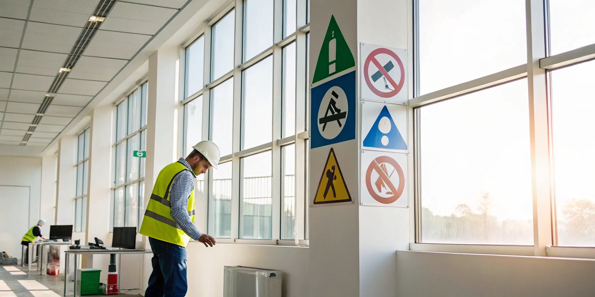
Have you ever stopped to think about the specific logic behind a safety sign? There’s a reason a warning is a yellow triangle and a mandatory action is a blue circle. This visual system is intentionally designed for instant recognition, cutting through workplace noise and language barriers to deliver critical information when seconds count. A deep understanding of workplace safety signs and symbols and their meanings is the foundation of any truly safe work environment. In this guide, we’ll decode this system for you, explaining what each color, shape, and icon communicates so you can build a clear and effective safety program.
Key Takeaways
- Master the Language of Safety Signs: Treat colors, shapes, and symbols as a universal code. Understanding that red means danger, blue means mandatory action, and green points to safety helps you choose the right signs and ensures your team gets the message instantly.
- Placement and Durability are Non-Negotiable: A sign is useless if it can’t be seen or read. Place signs at eye level in well-lit areas, choose materials that withstand your work environment, and avoid clutter to make sure your safety messages are always clear and effective.
- Make Training an Active, Ongoing Process: Don’t just put up signs and hope for the best. Turn signage education into a continuous part of your safety program with regular, interactive refreshers to ensure the information sticks and your team stays vigilant.
What Are Workplace Safety Signs?
Think of workplace safety signs as your silent safety officers. They are visual tools that use specific colors, shapes, and symbols to communicate important messages quickly and clearly. Their primary job is to prevent accidents and injuries by alerting everyone—from seasoned employees to first-time visitors—about potential dangers, mandatory actions, and emergency procedures. Whether it’s a warning about a slippery floor, a reminder to wear a hard hat, or a pointer toward the nearest fire exit, these signs are a fundamental part of a safe work environment.
Effective safety materials are designed for immediate understanding, often cutting through language barriers with universal symbols. They serve as constant reminders of safety protocols and help guide people’s actions, especially in high-stress or unfamiliar situations. By providing clear, concise information right where it’s needed, safety signs help build a proactive safety culture, protecting your team and keeping your operations running smoothly. They aren’t just a compliance checkbox; they are an essential communication system that keeps everyone informed and out of harm’s way.
Why Safety Signs Matter
Safety signs are crucial because they act as a first line of defense against workplace accidents. They instantly communicate risks and required precautions, helping to prevent injuries before they happen. Because they rely heavily on universal symbols, their messages can be understood by people from different backgrounds and language abilities, making them incredibly effective in diverse workforces. It’s important to remember that signs are not a substitute for comprehensive safety training. Instead, they reinforce that training, serving as constant, on-the-spot reminders that help employees make safer choices, particularly when they are new or working in an unfamiliar area of your facility.
Staying Compliant with OSHA and ANSI
Following safety regulations isn’t just good practice—it’s the law. The Occupational Safety and Health Administration (OSHA) and the American National Standards Institute (ANSI) set the standards for workplace safety signage. Specifically, OSHA 29 CFR 1910.145 requires that workplaces use consistent and clear safety signs. To stay compliant, you need to ensure signs are highly visible and placed in logical locations where hazards exist. They shouldn’t be hidden or clustered so closely together that they become overwhelming. Regular training is also key; your team needs to understand what each sign means to ensure the system is effective.
What Do the Colors and Shapes on Safety Signs Mean?
Safety signs are designed for quick recognition, using a consistent system of colors, shapes, and symbols to communicate important information at a glance. Understanding this visual language is the first step toward creating a safer workplace. When you need to order new safety materials, knowing what these elements mean will help you choose the right signs for every situation.
Decoding Safety Sign Colors
Think of safety sign colors as a universal code that gives you a heads-up about what’s going on. Each color has a specific job, helping you quickly assess a situation. Red is the most critical, signaling immediate danger, fire hazards, or the need to stop. Yellow or amber serves as a caution, pointing out potential risks like a wet floor or a low-hanging object. Green is your go-to for safety, marking the location of first aid kits, emergency exits, and safety equipment. Finally, blue indicates a mandatory action is required, like wearing safety goggles or a hard hat in a specific area. These colors are standardized to ensure everyone gets the same clear message, which is a core part of OSHA’s safety standards.
Understanding the Shapes
Just like colors, the shape of a safety sign gives you an instant clue about its message. A triangle is almost always a warning sign, alerting you to a potential hazard ahead. Think of the classic “slippery when wet” sign—its triangular shape immediately puts you on alert. Circles are used for mandatory actions or prohibitions. A blue circle typically means you must do something (like wear ear protection), while a circle with a red slash through it means something is not allowed. Squares and rectangles are the workhorses of safety signage, used to provide general information and safety instructions. These design principles are part of the ANSI Z535 standards, which create a consistent visual language for safety communication.
Universal Symbols for Clear Communication
Words are great, but in an emergency, a picture can be much faster. That’s where universal symbols, or pictograms, come in. These simple graphics are designed to be understood by anyone, regardless of the language they speak. This is incredibly important for creating an inclusive and safe environment for a diverse workforce. A symbol for an eye wash station or a biohazard warning conveys its message instantly, without requiring anyone to stop and read text. This quick comprehension is vital when a split-second reaction can prevent an injury. These internationally recognized symbols ensure that critical safety instructions are clear, concise, and accessible to every single person on your team.
The 4 Main Types of Workplace Safety Signs
Think of safety signs as a universal language for your workplace. They communicate critical information quickly, helping everyone stay safe without needing a detailed manual. These signs are grouped into four main categories, each with a distinct purpose and design. Understanding these types is the first step toward building a clear, compliant, and effective safety communication system. By using standardized safety materials, you ensure that every sign is instantly recognizable, protecting your team and visitors from potential harm.
Warning Signs
Warning signs are your first alert to possible dangers. Their job is to make people pause and be aware of a potential hazard in the immediate area. You’ll recognize them by their distinct yellow triangle with a black border and a simple black symbol inside. Common examples include signs for an ‘Electrical Hazard,’ ‘Flammable Material,’ or a ‘Slippery When Wet’ surface. These signs don’t forbid an action, but they do demand caution. They tell your team to be extra careful and mindful of their surroundings to avoid injury.
Mandatory Signs
If a warning sign says “be careful,” a mandatory sign says “you must do this.” These signs specify an action that is required to stay safe in a particular area. They are typically a solid blue circle with a white symbol. You’ve likely seen signs like ‘Wear Safety Helmet’ on a construction site or ‘Wear Eye Protection’ in a workshop. These instructions are not optional; they are a condition of entry or work. Following them is essential for personal safety and is often tied to company policy and Personal Protective Equipment (PPE) requirements.
Prohibition Signs
Prohibition signs clearly state what you are not allowed to do. These signs are designed to prevent actions that could create a significant risk to health and safety. The universal symbol for prohibition is a red circle with a diagonal line crossing over a black symbol of the forbidden activity. Classic examples include ‘No Smoking’ in areas with flammable materials or ‘No Entry’ for unauthorized personnel. These signs set firm boundaries and are crucial for preventing accidents by stopping dangerous behaviors before they start.
Emergency & Safe Condition Signs
When an incident occurs, these are the signs that guide people to safety. Emergency and safe condition signs point the way to essential facilities and equipment. They are always green with a white symbol or text, a color combination that signals safety and guidance. You’ll see them used for ‘Emergency Exit’ routes, ‘First Aid’ stations, and eyewash stations. These signs are a key part of any facility’s emergency action plan, providing clear, calm direction during stressful situations and helping everyone find help or a safe way out quickly.
Common Safety Symbols and What They Mean
Beyond the basic colors and shapes, the symbols on safety signs give you the specific information you need to stay safe. Think of them as a universal language for workplace hazards and procedures. Getting familiar with these common icons helps everyone understand expectations at a glance, whether they’re a new hire or a seasoned veteran. Recognizing these symbols quickly can make all the difference in preventing an accident or responding correctly during an emergency.
Fire Safety Symbols
When a fire breaks out, there’s no time to waste reading lengthy instructions. That’s why fire safety signs are designed for immediate recognition. You’ll typically see them as red squares or rectangles with a simple white graphic. These signs point you toward crucial firefighting equipment, like a fire extinguisher or a fire hose, and clearly mark the path to the nearest fire exit. Their job is to guide you to safety or to the tools needed to control a small blaze before it gets out of hand. Having clear, visible fire safety signs is a non-negotiable part of any workplace safety plan.
Personal Protective Equipment (PPE) Symbols
If you see a blue circle with a white symbol, pay close attention. This is a mandatory sign, and it’s telling you exactly what you must do to protect yourself in that area. These symbols indicate that Personal Protective Equipment (PPE) is required for entry or while performing a task. Common examples include icons for safety helmets, eye protection, ear protection, or safety gloves. These signs aren’t suggestions; they are rules put in place to prevent specific injuries. Understanding and obeying these PPE requirements is a fundamental responsibility for everyone on site.
Hazardous Material Symbols
Hazardous material symbols, often called pictograms, are your first warning about chemical dangers. Standardized under the Globally Harmonized System (GHS), these symbols appear inside a diamond with a red border. Each icon represents a specific type of risk, such as flammability, corrosiveness, acute toxicity, or danger to the environment. For example, a symbol of a flame indicates a fire hazard, while a skull and crossbones warns of a substance that can be fatal. These hazard pictograms are vital for anyone handling or working near chemicals, ensuring they take the proper precautions.
First Aid Symbols
In an emergency, knowing where to find help is critical. That’s where first aid and other safe condition signs come in. These are almost always a green square or rectangle with a white symbol. They act as beacons, guiding you to the location of first aid kits, emergency eyewash stations, automated external defibrillators (AEDs), or emergency exits. The universally recognized white cross on a green background instantly signals that help is nearby. Clear and well-placed safety materials ensure that anyone can find life-saving equipment or a safe way out when it matters most.
A Closer Look at Warning Signs
Warning signs are your first line of defense against potential hazards. Unlike prohibition signs that say “don’t,” or mandatory signs that say “must,” warning signs simply say “be aware.” They flag conditions that could cause minor or moderate injury if you’re not careful. Think of them as a proactive heads-up, alerting your team to risks before they become accidents. These signs typically feature a yellow or amber background with a black triangle, a color scheme designed to catch the eye and signal caution.
From a wet floor to the presence of heavy machinery, warning signs cover a wide spectrum of potential dangers. Their job is to make people pause and assess the situation, encouraging safer behavior around specific equipment or within a certain area. By clearly communicating risks, you empower your employees and visitors to take the necessary precautions. Having the right safety materials in place is a fundamental part of a comprehensive safety program, ensuring everyone on-site has the information they need to stay safe. Below, we’ll explore some of the most common categories of warning signs you’ll find in the workplace.
Chemical & Biohazard Warnings
When working with hazardous substances, there’s no room for misinterpretation. Chemical and biohazard warnings use universally recognized symbols to communicate specific dangers clearly and quickly. Many countries follow the Globally Harmonized System (GHS) to keep this information consistent across the board. For example, the GHS Health Hazard pictogram, which looks like a person with a starburst on their chest, indicates a substance that could cause cancer or respiratory harm. Similarly, the Flame pictogram is an unmistakable warning for flammable materials. These symbols provide critical, at-a-glance information in labs, manufacturing facilities, and healthcare environments where exposure risks are high.
Physical & Equipment Hazards
Physical and equipment hazards are some of the most common risks in any industrial or commercial setting. These warning signs alert people to dangers posed by machinery, electrical systems, and environmental conditions. You’ve likely seen signs for “Hot Surface” near ovens or engines, or “Live Electrical Equipment” on control panels—both are designed to prevent serious injuries like burns or electric shock. Other common examples include “Forklift Traffic Ahead” in a warehouse or “Slippery When Wet” in a recently cleaned hallway. These visual tools are essential for preventing accidents by making people aware of immediate dangers in their path.
General Safety & Facility Warnings
Sometimes, a warning needs to apply to a broader area rather than a single piece of equipment. That’s where general safety and facility warnings come in. These signs communicate precautions for an entire room or zone, such as “Hearing Protection Required Beyond This Point” at the entrance to a noisy factory floor. They serve as reminders of facility-wide policies or conditions that might not be immediately obvious. The effectiveness of these signs relies on their simple, universal design. By using consistent colors and symbols, you can ensure everyone understands the message instantly, helping to maintain a safe and compliant environment for your entire team.
A Closer Look at Emergency Signs
Unlike warning signs that alert you to potential danger, emergency signs are your guides to safety. Think of them as the calm, reassuring voice in a crisis, pointing you exactly where you need to go. Their primary job is to show the way to exits, first aid stations, and life-saving equipment. You’ll typically recognize them by their distinct green and white color scheme—a combination that’s universally understood to mean “go” or “safe condition.” In a high-stress situation where panic can set in, these signs cut through the confusion with clear, simple instructions.
Having a well-planned system of emergency signs is a fundamental part of any workplace safety program. It’s not just about compliance; it’s about providing your team with the confidence that they know what to do and where to go when it matters most. From marking a clear path out of the building to highlighting the location of a fire extinguisher, these signs are silent but essential tools for protecting your people. That’s why investing in clear, durable, and correctly placed essential safety solutions is one of the most important steps you can take for your facility.
Evacuation Routes
When an evacuation is necessary, there’s no time for confusion. Evacuation route signs create a clear, easy-to-follow path to the nearest exit. These signs are typically green squares or rectangles featuring a simple white symbol, like an arrow or a figure moving toward a door. The key to effective evacuation signage is strategic placement. They should be visible at every decision point along the escape route—in hallways, at intersections, and in stairwells—ensuring no one is left guessing which way to turn. For added protection, consider photoluminescent signs that glow in the dark, providing a visible guide even during a power outage.
Emergency Equipment Locations
In a crisis, every second counts. Signs that indicate the locations of emergency equipment are critical for enabling a quick response. These signs point out where to find vital tools like fire extinguishers, first aid kits, automated external defibrillators (AEDs), and eyewash stations. By making this equipment easy to spot, you empower your team to act swiftly and confidently, potentially preventing a minor incident from becoming a major one. Clear signage ensures that anyone, including visitors or new employees, can quickly find the necessary tools without wasting precious time searching.
Safety Zones & Assembly Points
Getting everyone out of the building is the first step, but knowing where to go next is just as important. Assembly point signs designate a safe area outside for everyone to gather after an evacuation. This is crucial for conducting an accurate headcount and ensuring that every single person is accounted for. These signs are designed to be universally understood, using simple pictograms that transcend language barriers. Placing a large, highly visible assembly point sign in an open area away from the building helps create order out of chaos and confirms that your team has reached a secure location.
Common Challenges with Safety Signage
Putting up safety signs is a critical first step, but it’s not the last. To truly create a safe environment, your signage system needs to be effective, and that means overcoming a few common hurdles. Many businesses find that even with the best intentions, their signs can lose impact over time or fail to communicate clearly. Issues like placement, material durability, and even the sheer number of signs can make the difference between a message that’s seen and one that’s ignored.
The goal is to make sure your signs are not just present, but powerful. This involves thinking about how your team interacts with their environment every day. Are the signs clear and easy to spot? Are they holding up to the working conditions? Are people actually paying attention to them? Addressing these challenges head-on ensures your investment in safety signage pays off by protecting your team and keeping your workplace compliant.
Avoiding ‘Sign Blindness’
Have you ever noticed that you stop seeing things you look at every day? That’s the idea behind ‘sign blindness.’ When workers are exposed to the same warnings day in and day out, they can become desensitized and start to tune them out. This is one of the most common challenges with safety signs, as it can lead to missed warnings and an increased risk of accidents. To combat this, keep your signage fresh and relevant. Regularly review your signs, remove any that are no longer necessary to reduce clutter, and use safety meetings to draw attention to specific warnings. The key is to make sure your signs remain a noticeable part of the environment, not just background noise.
Proper Placement and Visibility
A safety sign can only do its job if it’s seen. Improper placement is a simple mistake that can render a sign completely useless. If a sign is hidden behind equipment, placed too high or too low, or located in a poorly lit area, your team might miss it entirely. An effective safety sign needs to be placed in a clear line of sight, ideally at eye level, where it can grab attention before someone enters a hazardous area. It should be concise, highlighting the nature of the hazard and the specific action required to stay safe. Thinking strategically about where to place signs is just as important as the message on the sign itself.
Choosing Durable Materials
The material your safety sign is made from matters more than you might think. A sign that fades, peels, or cracks after a few months in the sun or exposure to workplace conditions isn’t just an eyesore—it’s a safety liability. Choosing the wrong material can make vital messages unreadable and undermine your entire safety program. Your signs need to withstand their environment, whether that means UV-resistant materials for outdoor use, chemical-resistant finishes for industrial areas, or sturdy floor decals for high-traffic zones. Investing in high-quality, essential safety solutions ensures your warnings remain clear and legible for years to come, protecting both your team and your business.
How to Train Your Team on Safety Signs
Putting up the right signs is a great first step, but it’s only half the battle. For your workplace to be truly safe, your team needs to understand what every sign means and what action to take. Effective training transforms safety signs from simple wall decor into active tools that protect your employees. It’s not a one-time task you can check off a list; it’s an ongoing commitment to building a culture of awareness and caution.
When your team is well-versed in safety signage, they can react quickly and correctly in any situation, from handling hazardous materials to evacuating during an emergency. Investing in proper training ensures your investment in high-quality essential safety solutions pays off by preventing accidents and keeping everyone safe. The following strategies will help you create a training program that sticks, making sure every team member knows exactly how to read the signs.
Use Interactive Training
Nobody learns well by just reading a dry manual. To make safety knowledge stick, you need to get your team involved. Turning safety guides into engaging training helps workers better understand potential hazards and the procedures to follow. Instead of a lecture, try hands-on activities. You could organize a facility walkthrough where employees identify different signs and explain their meanings. Simple quizzes or simulated emergency drills are also great interactive training methods that can improve how well your team remembers and understands safety protocols. When people actively participate in their learning, the lessons are much more likely to be remembered when it counts.
Schedule Regular Refreshers
Even the best training can fade from memory over time. That’s why regular training on what safety signs mean is so important for maintaining a safe workplace. Scheduling periodic refreshers—whether quarterly, semi-annually, or annually—keeps safety top of mind for everyone. These sessions are a perfect opportunity to review existing signage, introduce any new signs, and discuss recent near-misses or incidents. Consistent training helps your team develop a true safety mindset, ensuring they are always aware of their surroundings and the latest safety protocols. It shows your commitment to their well-being and reinforces that safety is a shared responsibility.
Support a Multilingual Workforce
In a diverse workforce, you can’t assume everyone understands English perfectly. While universal symbols are designed to cross language barriers, you still need to educate workers on what the colors and symbols on safety signs mean. It’s crucial to ensure that all employees, regardless of their primary language, understand the importance of following safety rules. You can support your team by providing training materials in multiple languages, using visuals and demonstrations, and having bilingual staff or interpreters assist during training sessions. Making your safety program accessible to everyone is key to protecting all workers and creating an inclusive environment where everyone feels safe.
Why Design Matters for Safety Sign Effectiveness
A safety sign is more than just a piece of plastic with words on it; it’s a critical communication tool that protects your team. But for a sign to do its job, it has to be seen, read, and understood in a split second. This is where thoughtful design comes in. A poorly designed sign—one that’s too small, uses a confusing font, or blends into the background—is just as bad as no sign at all. In a fast-moving work environment, clarity is everything.
Effective design ensures your message cuts through the noise. It considers how people see and process information, especially under pressure. Elements like font choice, color contrast, and strategic placement work together to create a visual cue that is impossible to ignore. When you invest in well-designed safety materials, you’re not just checking a compliance box; you’re building a stronger, more intuitive safety culture where everyone knows how to stay out of harm’s way. Let’s look at the key design elements that make a safety sign truly effective.
Readability and Clear Fonts
A sign’s primary job is to be read, often from a distance or in a hurry. If the font is too stylized, too small, or too crowded, the message gets lost. That’s why choosing a clear, legible font is non-negotiable. Think simple, bold, sans-serif typefaces like Helvetica or Arial. These fonts are clean and easy to decipher at a glance, which is crucial for conveying urgent information. OSHA has specific workplace requirements for a reason: consistency and clarity prevent injuries. Avoid decorative or script fonts, as they can be difficult to read and may compromise the sign’s effectiveness in a critical moment.
High-Contrast Colors for Visibility
Color is one of the fastest ways to communicate a message. In safety signage, high-contrast color combinations are used to grab attention and convey the level of risk instantly. Think of a classic yellow “Caution” sign with black text—it’s impossible to miss. Using standardized colors helps workers quickly recognize the nature of a hazard. As the Texas Department of Insurance explains, consistent use of color and symbols helps people act more safely. Red signals danger or fire equipment, orange indicates a warning, yellow means caution, and green points to safety. Using these colors correctly and consistently creates a universal language that everyone on your team can understand.
Optimizing Sign Size and Placement
You could have the most beautifully designed sign in the world, but if it’s hidden behind a piece of equipment or placed too high to read, it’s useless. The size and placement of your signs are just as important as their design. A sign must be large enough to be read from a safe distance and placed in a clear line of sight. As safety experts at REGALTAG point out, putting signs in the wrong place can make them completely ineffective. Before installing a sign, consider the environment: What are the lighting conditions? From what angles will people approach? The goal is to make the sign an unmissable part of the landscape.
Best Practices for Your Safety Signage System
Creating a safe workplace goes beyond just buying signs and putting them on the wall. An effective safety signage system is a well-thought-out strategy that requires attention to placement, maintenance, and training. When you approach your signage with a clear plan, you ensure every sign serves its purpose: to communicate clearly, prevent accidents, and keep your team safe. By following a few key best practices, you can turn your collection of signs into a cohesive system that actively contributes to a strong safety culture. These steps will help you make sure your visual cues are seen, understood, and followed every single day.
Place Signs Strategically
Where you put a sign is just as important as what it says. For a sign to be effective, it needs to be seen. Place signs in well-lit areas at eye level, where they are impossible to miss. They should be located directly in a person’s line of sight as they approach a potential hazard. Avoid placing them behind doors, equipment, or in cluttered areas where they might be obscured. It’s also important not to overwhelm your team with too much information at once. Clustering too many signs can lead to ‘sign blindness,’ where employees start to ignore them altogether. A good rule of thumb is to give each sign its own clear space to deliver its message without competition.
Keep Signs Maintained and Compliant
Workplace safety is not a set-it-and-forget-it task. Over time, signs can fade, get damaged, or become dirty, making them difficult to read. Regularly inspect your signage for wear and tear and replace anything that’s no longer clear and legible. Using durable, high-quality materials from the start can save you time and money in the long run. Beyond physical condition, it’s crucial to ensure your signs comply with current OSHA regulations, which can change as new technologies or work processes are introduced. A regular audit of your signage helps you stay compliant and keeps your safety messages accurate and relevant for your team.
Integrate Signs into Your Safety Program
Safety signs are most effective when they are part of a comprehensive safety program. Don’t just assume everyone understands what each symbol and color means. Incorporate signage education into your new employee onboarding and hold regular refresher sessions for your entire team. When you explain the ‘why’ behind each sign, you build a deeper understanding and appreciation for your safety protocols. Use your signs as daily teaching tools to reinforce safe practices and requirements, like wearing personal protective equipment (PPE). When signs are an active part of your safety culture, they become powerful reminders that help make safety an instinct, not an afterthought.
Related Articles
- Essential Safety Solutions | Printworks | We’ve got you covered!
- Covid Signage | Printworks | We’ve got you covered!
- Signs | Printworks | We’ve got you covered!
- Packages | Printworks | We’ve got you covered!
- Yard Signs | Printworks | We’ve got you covered!
Frequently Asked Questions
How often should I inspect my safety signs? Think of your safety signs like any other piece of essential equipment. They need regular check-ups to make sure they’re still doing their job. A good practice is to include a signage review in your routine safety audits, perhaps quarterly. You’re looking for signs that are faded, dirty, damaged, or no longer clearly readable. Also, take a moment to confirm that the sign is still relevant for that area, as workplace layouts and hazards can change over time.
What’s the most common mistake people make with safety signs? The biggest mistake is poor placement. You can have a perfectly designed, compliant sign, but if it’s hidden behind a piece of machinery, placed too high to read, or stuck in a poorly lit corner, it’s completely ineffective. A sign needs to be in a clear line of sight, giving people enough time to see it, understand the message, and react accordingly before they encounter the hazard.
My team speaks multiple languages. Are symbols enough to keep everyone safe? Universal symbols are an incredibly powerful tool for overcoming language barriers, but they shouldn’t be your only strategy. True safety comes from understanding, not just recognition. It’s essential to provide training that explains what each symbol, color, and shape means. This ensures everyone, regardless of their primary language, understands the specific hazard or instruction and knows exactly what action to take.
What’s the real difference between a warning sign and a mandatory sign? It comes down to “be aware” versus “you must.” A warning sign, which is typically yellow, gives you a heads-up about a potential danger, like a slippery floor. It asks you to be cautious. A mandatory sign, which is usually a blue circle, gives you a direct order that you must follow for your own protection, such as wearing a hard hat. One is an alert, while the other is a non-negotiable rule for that area.
Is it a good idea to combine multiple warnings onto a single sign? While it might seem efficient, it’s generally best to avoid cluttering one sign with too many messages. The goal of a safety sign is instant comprehension. When a sign is too busy, it can be confusing and slow down a person’s reaction time. Clear, simple signs dedicated to a single, specific hazard are almost always more effective at communicating the message quickly and preventing accidents.