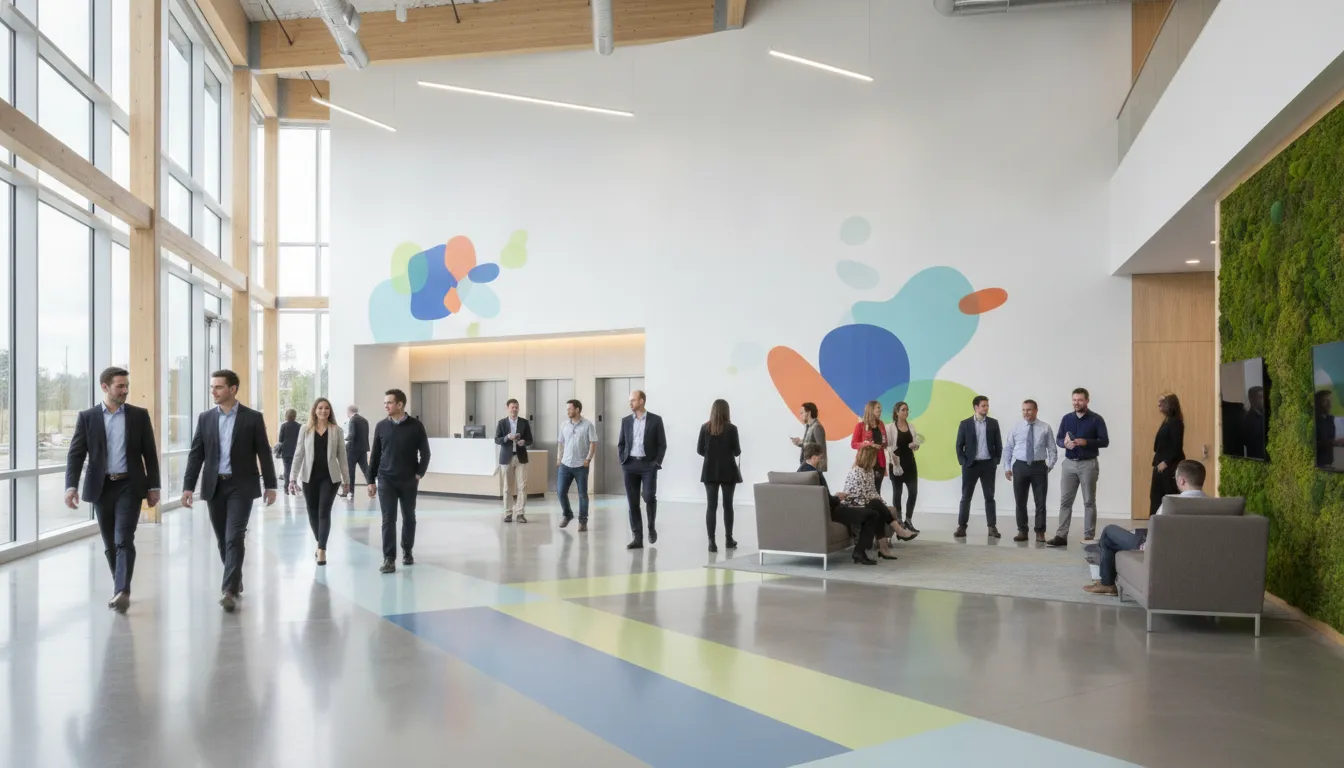
People notice a confusing route before they notice a polished interior. A coordinated path of wall and floor graphics can help visitors find reception, restrooms, meeting rooms, or service areas while giving the workplace a consistent visual identity.
Well-planned office wayfinding graphics combine floor cues, wall messaging, and clear visual hierarchy to guide movement. Reinforce brand identity, and support a more confident experience for visitors and staff.
For Portland-area workplaces and public facilities, the strongest results begin with the journey rather than a collection of isolated signs. Mapping destinations, decision points, traffic patterns, and brand touchpoints helps determine where each graphic belongs and which material can withstand the setting. APM PrintWorks supports large-format graphic planning, production, and installation from its Beaverton base.
How Office Wayfinding Graphics Begin With the Journey
Effective navigation starts before anyone chooses a wall, floor, or directional graphic. Begin by tracing how people actually move through the facility. A visitor may enter through a main lobby, look for reception, find a meeting room, and then return by a different route. Staff may use a service entrance, move between departments, and rely on familiar shortcuts. These journeys have different needs, even when they share the same building.
Map the important destinations first. Include entrances, reception areas, elevators, stairs, restrooms, meeting rooms, shared amenities, and department zones where relevant to the project. Then identify decision points, such as a lobby split, a corridor intersection, or a transition from public space to an employee-only area. Those moments are where people need a clear cue. A graphic placed after the decision can be attractive but ineffective if the visitor needed direction several steps earlier.
Look for friction before choosing graphic locations
Walk the route as a first-time visitor and note where people pause, backtrack, ask for help, or cluster around a doorway. Those behaviors reveal route friction that a floor plan may not show. Staff interviews can add another layer, especially in offices where employees know the building well but visitors do not. The goal is not to cover every available surface. It is to place coordinated cues where they make movement easier without creating visual confusion.
This is where custom floor graphics can work with wall-based communication. Floor graphics can reinforce direction across an open lobby or corridor, while wall graphics can identify a destination, frame a transition, or establish a branded zone. Used together, they create continuity between the path and the place it leads to. The system can also include windows or other architectural surfaces when they contribute to the route.
Connect navigation to the brand experience
Brand touchpoints should support the journey rather than compete with it. A company value or visual motif may belong near reception or a collaboration area, while a department identifier may be more useful at the point of arrival. In public-facing spaces, consistent colors, shapes, and graphic treatments can help visitors recognize that they are still following the intended route. APM describes this as a coordinated system that connects wall, floor, window, and directional elements before production and installation begin.
That approach differs from general sign planning because the emphasis is on the complete visual journey. For Portland-area offices and facilities, APM PrintWorks can help plan large-format wall and floor graphics as one project, from mapped routes and mockups through production and installation.
What Should a Clear Wayfinding Hierarchy Include?
A useful wayfinding system gives people the right amount of information at each point in a journey. Instead of placing every message everywhere, organize the experience so visitors and staff can move from arrival to destination with fewer questions and less visual confusion. Office wayfinding graphics work best when wall and floor elements share the same colors, shapes, symbols, and naming conventions.
1. Arrival: Establish the starting point
The arrival layer helps people understand where they are and what kind of place they have entered. A branded wall graphic, reception feature, or clearly positioned welcome element can establish the visual language for the rest of the facility. Keep the message easy to scan from the approach, especially where visitors may be orienting themselves while entering, checking in, or looking for reception.
2. Directional: Show the next decision
Directional graphics answer the immediate question, “Which way do I go?” Use them at intersections, corridor openings, elevator lobbies, and other decision points. Wall graphics can carry larger directional messages where they are easy to see ahead of a turn. Floor graphics can reinforce the route with arrows, lines, color fields, or other simple visual cues. Used together, they connect the vertical and horizontal planes without asking one element to carry every instruction. Floor graphics can support organized movement through workplaces and other facilities when their placement follows the actual path people take.
3. Identification: Name the place
Once someone reaches a corridor, department, conference room, or service area, identification graphics confirm the destination. Use consistent naming, type treatment, and placement so people learn what to look for as they move through the building. Frosted window or glass graphics may help identify offices and positions while adding a branded layer to the environment. The goal is recognition at a glance, not a dense block of copy.
4. Confirmation: Reassure people they are on track
Confirmation elements reduce uncertainty after a turn or transition. A small wall marker, repeated color cue, or continuation of a floor path can tell people they made the correct choice. These signals are especially helpful on long corridors or in buildings where several routes appear similar. Repeat only the cues that genuinely help. Too many competing messages can make a well-intended system harder to read.
5. Destination: Make arrival unmistakable
At the destination, the visual system should resolve the journey. A clearly identified room, department, or public-facing area gives visitors confidence that they have arrived. Destination graphics can also reinforce the character of the workplace through wall treatments, branded color, or a carefully selected environmental image, while preserving a clear primary label.
Accessibility-aware planning should inform every layer. Consider legibility, contrast, viewing height, unobstructed paths, and a restrained visual palette during design review. These are planning considerations, not a guarantee of legal compliance. Facility-specific requirements should be confirmed for the project. A coordinated system, reviewed from the viewpoint of both visitors and staff, creates a more understandable route from the front door to the final destination.
How Can Wall and Floor Graphics Support Accessibility-Aware Planning?
Accessibility-aware planning starts before artwork is finalized. Wall and floor graphics should help people understand where to go without creating another visual obstacle in the environment. That means reviewing the design alongside the building layout, circulation patterns, lighting, surfaces, and the needs of the people who use the facility.
Design for legibility and contrast
Directional messages, symbols, and destination names need to be easy to distinguish at the intended viewing distance. Clear type, simple shapes, and strong contrast between the graphic and its background can make information easier to find. Contrast should be reviewed in the actual space, not only on a monitor or a small proof. Glare, shadows, textured walls, changing daylight, and nearby branded elements can all affect how a graphic is perceived.
Visual consistency also matters. Reusing a restrained color system and familiar directional cues across walls and floors can reduce the effort required to interpret each message. Avoid filling every available surface with competing patterns or instructions. A coordinated system should make the next decision apparent rather than asking visitors to sort through too much information at once.
Protect clear paths and practical sightlines
Floor graphics should be placed with circulation in mind. Before selecting a location, review door swings, corners, queues, furniture, equipment, and areas where people may pause. A graphic that looks clear in a plan can become confusing when it is partly covered by a temporary display or positioned where traffic naturally converges. Keep primary paths visually and physically unobstructed, and make sure wall graphics do not compete with signs, handrails, or other important building features.
Viewing height is another useful planning consideration. Place key information where the intended audience can reasonably see it, while checking how the message works for people approaching from different directions. A wall graphic near an entrance may need to serve arriving visitors, staff moving between rooms, and people waiting nearby. Mockups that show the graphic in context can reveal problems with scale, placement, and sightlines before production.
Confirm facility-specific requirements
Accessibility requirements depend on the specific facility, its users, and the project conditions. A thoughtful graphics plan is not the same as a blanket claim of legal compliance. Facility owners, architects, designers, and other qualified project stakeholders should review applicable requirements for the space and confirm what the finished system needs to provide.
For Portland-area offices and public facilities, APM PrintWorks can support that review with design development, mockups, material planning, production, and installation coordination. The goal is a clear, visually calm route that supports the facility’s broader communication plan while leaving project-specific accessibility decisions with the appropriate team.
Choosing Materials for Walls, Floors, and High-Traffic Routes
Material selection should follow the route, surface, and expected use, not just the appearance of the finished graphic. A wall graphic may need to conform to texture and remain stable as a branded backdrop. While a floor application must account for foot traffic, cleaning, and the condition of the floor beneath it. For an integrated office wayfinding graphics system. Choosing each material as part of the same plan helps the visual language stay consistent without forcing every application into one format.
| Option | Best fit | Planning note |
|---|---|---|
| Textured wall decals | Branded walls and destinations | Conformable vinyl with laminate suits medium to heavily textured surfaces. Review wall condition and permanence. See commercial wall graphics. |
| Floor decals | Temporary route cues on smooth floors | APM describes use up to twelve months with UL-listed PSV and laminate. Review traffic, cleaning, and surface condition. |
| Custom floor mats | Entrances and branded thresholds | Dye sublimation provides vibrant color, with seamless production up to 10 feet wide. Confirm dimensions and cleaning. |
| Pavement or sidewalk decals | Outdoor pedestrian areas | Review exposure, traffic, cleaning, and installation conditions. Explore custom floor graphics. |
The right combination may use a durable wall treatment for identification, a removable or temporary floor decal for changing routes, and a custom mat at the arrival point. Permanence should reflect how often the space, tenant, department, or visitor journey is likely to change. Traffic should influence the floor specification, while the wall surface should guide adhesive and laminate selection.
For Portland-area offices and public facilities, APM PrintWorks can coordinate design, mockups, material selection, production, and professional installation as one large-format project. That integrated review makes it easier to keep colors, directional cues, and maintenance expectations aligned from the first wall to the final floor transition.
Installation Sequencing: From Mockup to Finished Route
A coordinated installation begins before any material reaches the site. APM PrintWorks frames the work through a Dream, Plan, Create process: align on the vision. Assess the space and specifications, develop mockups, then produce and install the finished graphics. That sequence gives facility teams a chance to review how wall and floor elements work together before production begins.
For office wayfinding graphics, the route should be treated as one connected experience rather than a collection of isolated decals. A visitor may move from an entry point to reception, a meeting area, a stairwell, or a shared amenity. Staff may follow a different path through service corridors or restricted areas. Mapping these movements first helps identify where a graphic needs to direct, identify, reinforce a destination, or simply confirm that someone is still on the right path.
- Survey the site and map the route. Document entrances, decision points, destinations, wall conditions, floor surfaces, sightlines, circulation patterns, and areas where installation access may be limited. For a multi-location project, collect comparable information at every site so the system can remain consistent while still fitting each facility.
- Develop the route map and mockups. Translate the journey into a graphic plan showing how floor paths, wall messages, and other visual elements relate to one another. Mockups should be reviewed at the intended viewing distance and height, with attention to legibility, contrast, unobstructed paths, and visual simplicity. Accessibility requirements should be confirmed through a project-specific review rather than assumed from a mockup alone.
- Finalize specifications and produce the graphics. Confirm dimensions, artwork, materials, quantities, surface requirements, and installation notes before production. APM provides creative and design support, mockup development, production, and professional installation for large-format graphics. Clear specifications reduce avoidable changes when wall and floor components move into production together.
- Prepare the surfaces and installation area. Coordinate access with the facility team, complete the needed surface preparation, and confirm that floors and walls are ready for the selected materials. Clean, suitable surfaces and a clear route help installers position graphics accurately and protect the intended finish.
- Install in route order, then walk through the result. Installers can sequence the work around site access, traffic, and the relationship between major destinations. After installation, the project team should walk the route from a visitor’s perspective, checking placement, alignment, edges, sightlines, and transitions between wall and floor graphics. Capture any adjustments for the local site or for the next location in a broader rollout.
For Portland-area organizations, a nearby production and installation partner can simplify site communication and on-site decisions. APM serves the Greater Portland area from Beaverton and can also coordinate large-format installation locally and nationwide. This supports organizations managing several offices or facilities without inventing a one-size-fits-all schedule.
Maintenance Planning for Branded Navigation Graphics
Maintenance should be part of the office wayfinding graphics plan before materials are ordered. A route that looks polished at installation can change quickly when cleaning practices, foot traffic, surface conditions, or facility schedules do not match the original assumptions. Review each wall and floor application with the facility team, then document how it should be cleaned, inspected, repaired, and eventually replaced.
Start with the cleaning method. Confirm which products, tools, and procedures are appropriate for each surface and finish, and make sure the cleaning team understands where graphics are installed. Floor graphic longevity is affected by cleaning as well as traffic, surface conditions, material choice, and ongoing maintenance. For smooth interior floors, APM floor decals are intended for temporary use up to twelve months. But that product guidance is not a universal lifespan for every graphic or environment. For a deeper planning reference, review this guide to floor graphic maintenance.
Build inspections into normal facility checks rather than waiting for a visible failure. Look for lifting edges, scuffs, scratches, fading, bubbling, separation, or changes in the underlying surface. Edge wear deserves particular attention on floor applications because repeated foot traffic and cleaning can gradually affect the perimeter. On walls, inspect corners, seams, textured areas, and locations near doors, furniture, or equipment that may receive repeated contact.
Surface conditions should also be recorded when a problem appears. A graphic may be responding to moisture, residue, an uneven substrate, aggressive cleaning, changing temperature, or traffic beyond the original expectation. Sharing those observations with the printer and facility team helps distinguish a material issue from a surface or maintenance issue. It also supports better decisions when a route needs to be refreshed or expanded.
Plan replacements around operations and change cycles
Replacement timing should follow the condition of the graphic, the role it plays in navigation, and the organization’s planned changes. Replace a damaged directional element before it creates confusion, even if nearby branding still looks acceptable. Coordinate routine refreshes with relocations, department changes, remodels, rebrands, and seasonal updates so the system remains consistent across walls, floors, and other touchpoints.
Keep a simple record of material specifications, installation dates, cleaning guidance, high-traffic areas, and approved artwork. That information makes future replacements more predictable and helps a Portland-area facility team maintain a consistent visual system instead of treating every repair as an emergency.
Frequently Asked Questions
What is wayfinding signage in an office?
Wayfinding signage is a coordinated visual system that helps people orient themselves, choose the right route, and locate destinations. In an office, it can combine wall graphics, floor graphics, room identification, directional cues, and confirmation points. Planning the system around visitor and staff journeys can reduce confusion while making the workplace feel more intentional and connected to the brand.
What materials work best for floor graphics?
For busy corridors, choose floor-rated vinyl with a durable, slip-resistant laminate and a textured finish. The right material depends on foot traffic, cleaning methods, surface condition, and whether the graphic is temporary or intended for longer service. A production partner should confirm the surface preparation and installation requirements before recommending a material.
What are the ADA rules for office signs?
Accessibility should be reviewed during planning, especially for permanent room identification and directional signs. Consider legibility, strong contrast, non-glare surfaces, viewing height, tactile information where applicable, and clear paths that do not create obstructions. Requirements vary by sign type and project conditions, so have the final system reviewed for project-specific accessibility needs rather than treating graphics alone as a compliance guarantee.
How does office branding improve company culture?
Thoughtful branding turns otherwise plain walls, glass, and circulation areas into consistent expressions of the organization. Values, color, imagery, and directional cues can create a more welcoming experience for visitors and a stronger sense of place for employees. The best results balance brand expression with readability, navigation, and the practical needs of the space.
Ready to Plan Your Wayfinding Graphics?
A coordinated wall and floor graphics system can help visitors move through your facility with greater clarity while reinforcing your brand at key touchpoints. A thoughtful plan also helps align materials, installation sequencing, and maintenance with the needs of your space. APM PrintWorks can help Portland-area organizations shape the project from initial goals through production and installation.